ADEACA is internationally known for their Enterprise Resource Management system: ADEACA ONE. Their software tests ERP fundamentals and breaks free from the generic cookie cutter form that plagues other ERP-systems. Our team was contacted by ADEACA to refresh their company’s website with a unique, modern experience that reflects their brand identity and product. We were happy to collaborate with ADEACA’s international team to design and develop this exciting website refresh.
Every now and then, our team gets the opportunity to work with clients that have a solid brand, with the style guides to back it up. ADEACA not only had a general design concept, but they also had ideas on how they wanted it to work. What they needed was an expert team to help visualize their ideas and develop them to their full potential. They provided us with strict visual guidelines to follow for the website redesign that described their desired look, feel, and functionality. We helped bring those ideas to life.
Below are highlights of how we applied the guidelines that were provided by the client. We drew from the guidelines to create a well-rounded, beautiful design emphasizing specific details important to ADEACA.

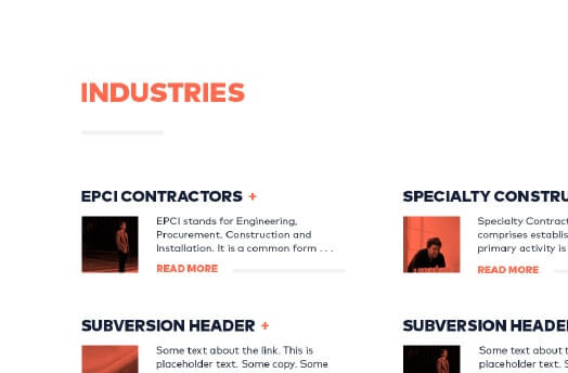


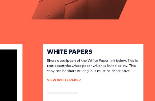
From early on, the menu became a focal point for the site’s structure and layout. It quickly became quite the marketing challenge; we had to balance the selling power of the website with the expansive knowledge base of information provided to the users. Being a large, content-heavy website, there needed to be some division between what users see on each page and the content available to browse on the site. We tackled this with an elegant solution of having two separate menus for each purpose.
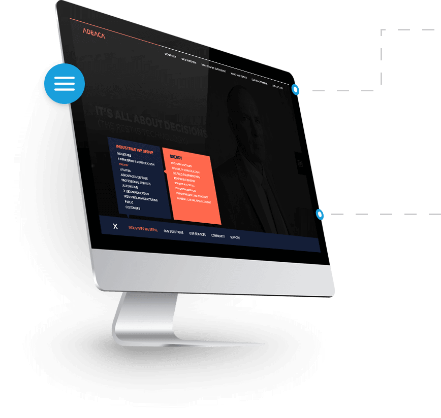
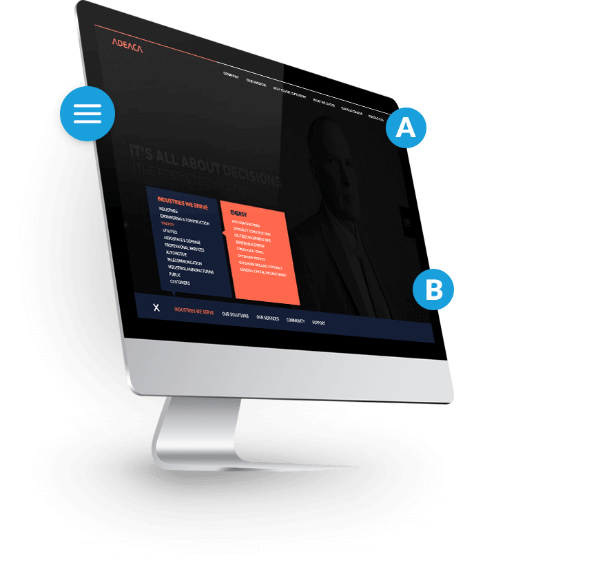
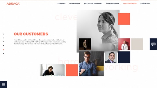
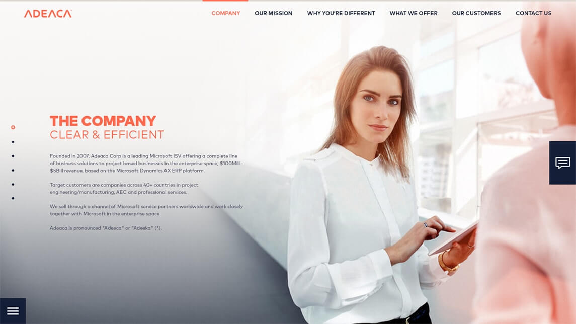
The menu located at the top of the site is a local menu, and is fixed to the top of the page. It allows users to quickly navigate the page that they are currently viewing. This feature was necessary to make all of the content easily accessible.
The menu located at the bottom of the screen is, also, fixed to the screen. It contains links to all of the content available to browse on the website, and is essentially a sitemap. This menu equally acts as a footer, containing links to everything that is to be found on the site.
Although the client had a clear vision they wanted to pursue, it was our job to transform their ideas into something tangible. The challenge was to balance accessibility and a modern design with marketing objectives.
Our team created two alternate options with a focus on the functionality of the dual menu system. We wanted the navigation to be easily understood for ADEACA’s target audience. The client ultimately decided to expand on the ideas of the split top and bottom menu to let the full-screen imagery shine.
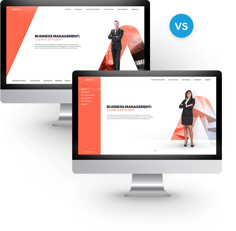
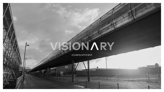
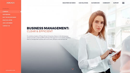
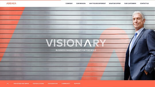
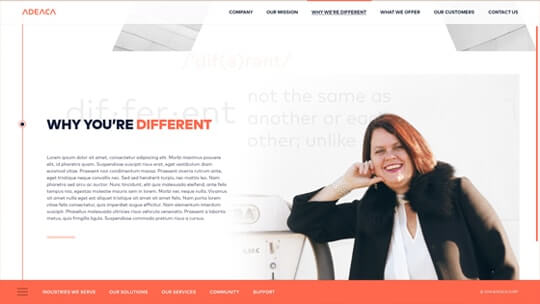
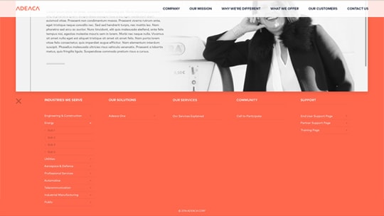
The menu located at the bottom of the screen is, also, fixed to the screen. It contains links to all of the content available to browse on the website, and is essentially a sitemap. This menu equally acts as a footer, containing links to everything that is to be found on the site.

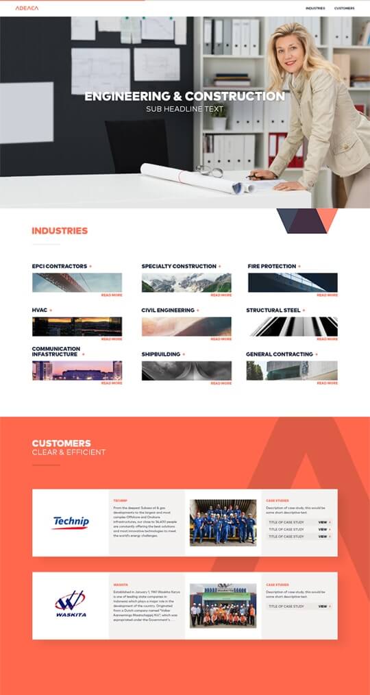
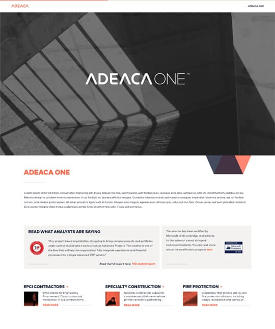
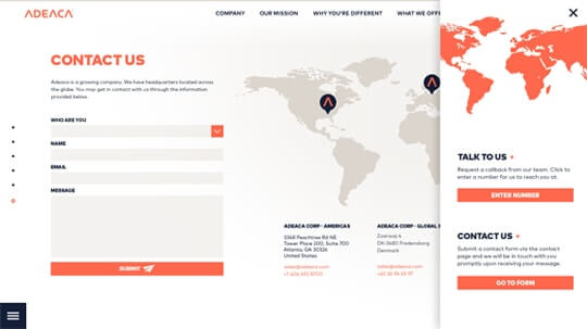
Once the final design was established, it didn’t take long for the project to piece together. Countless designs were reviewed and revised in order to ensure everything was spot-on before moving to development. Below is a collection of designs that made it to production.

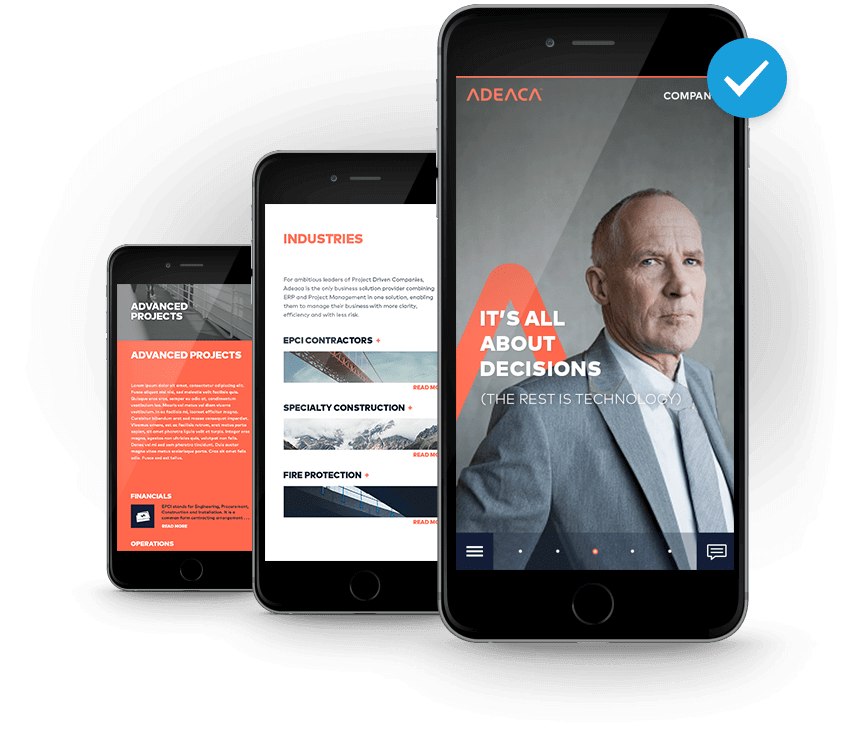
All of our websites are built responsively, which means that they’re built to work on desktops, laptops, tablets, and mobile devices. With all of the content included in the website, it was important to streamline the design and navigation for mobile users.
Every team member signs their name to each project to show they stand by it.


